Homemove
Homemove • Branding and Creative Content Manager
Homemove is an all-in-one platform designed to simplify the home-moving process. By connecting users with expert support and trusted partners, it streamlines everything from surveys and mortgages to packing and moving, making the experience smoother and stress-free.
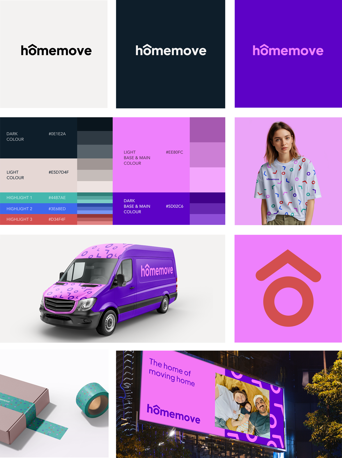
The goal was to create a logo and visual identity that felt approachable and welcoming while also capturing the sense of movement and progress that Homemove stands for.
To achieve this, I led a series of collaborative workshops with the CEOs, ensuring their vision was at the heart of every decision. These sessions provided a platform to align on core values, explore creative directions, and refine the brand’s essence together.

The colour palette is bright and bold, designed to catch attention while still feeling warm and cosy. It’s vibrant without being too much, creating an inviting and balanced look that feels approachable and full of energy.
Communication was the key to success throughout the process. From brainstorming initial concepts to presenting polished designs, I maintained an open dialogue with stakeholders, fostering trust and ensuring that the final branding reflected both the company's ethos and its ambitions.
The result is a cohesive, engaging brand identity that resonates with Homemove’s audience and supports its mission to make moving easier and more enjoyable.

THE LOGO
The brief was to create a logo that feels familiar, warm, and friendly—while standing out as dynamic and distinctive. I wanted the design to reflect the essence of "move" with an approachable, lively twist.
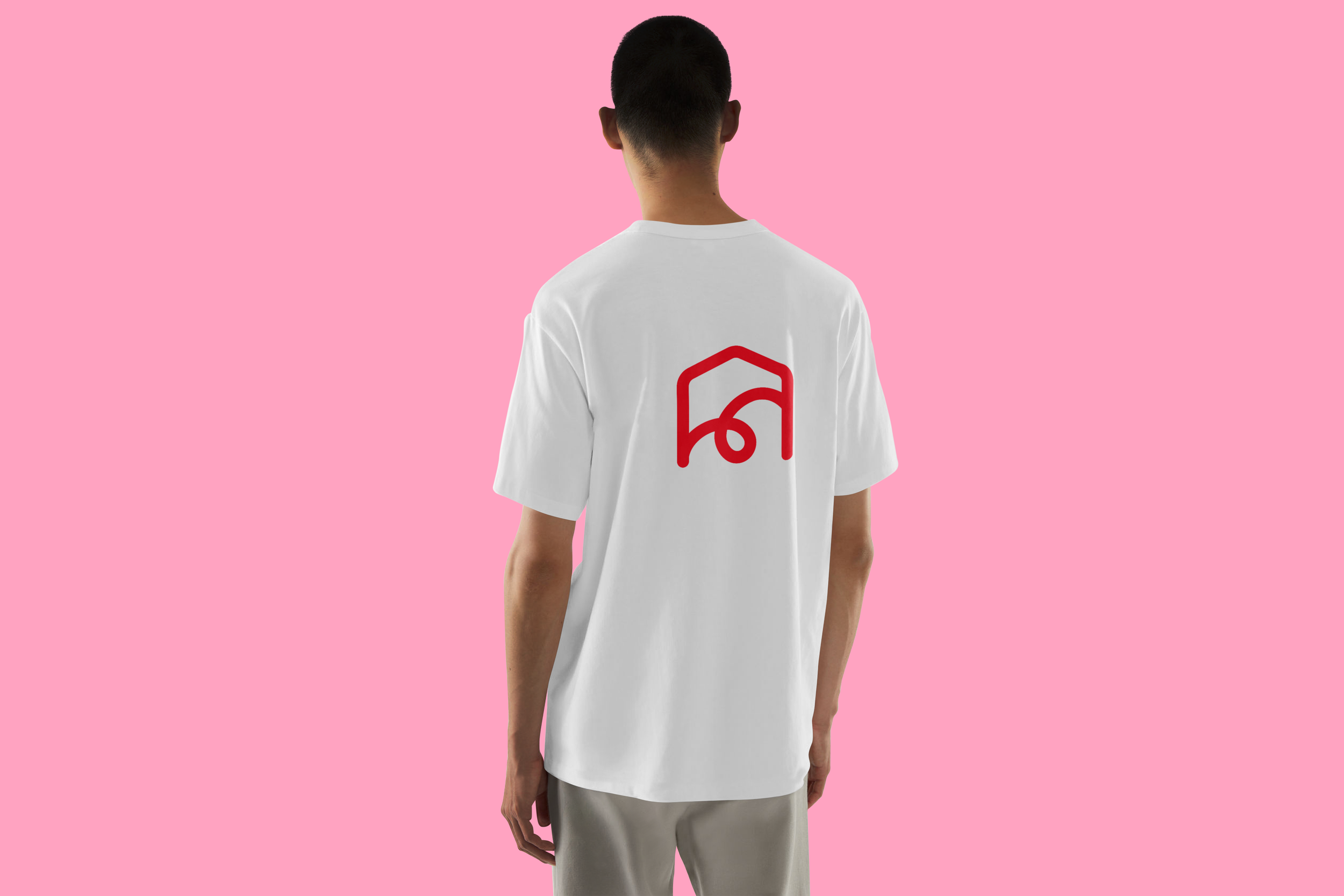
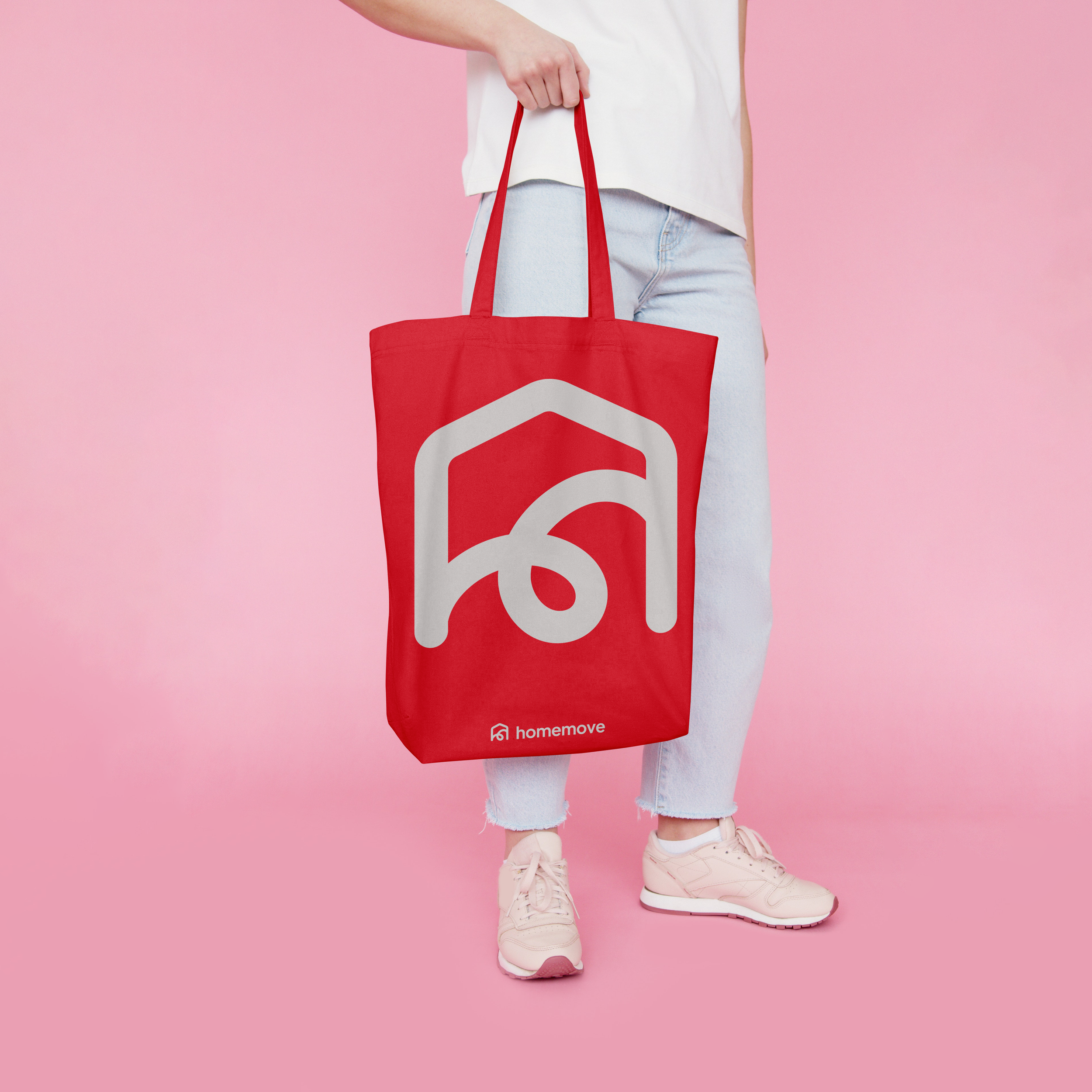
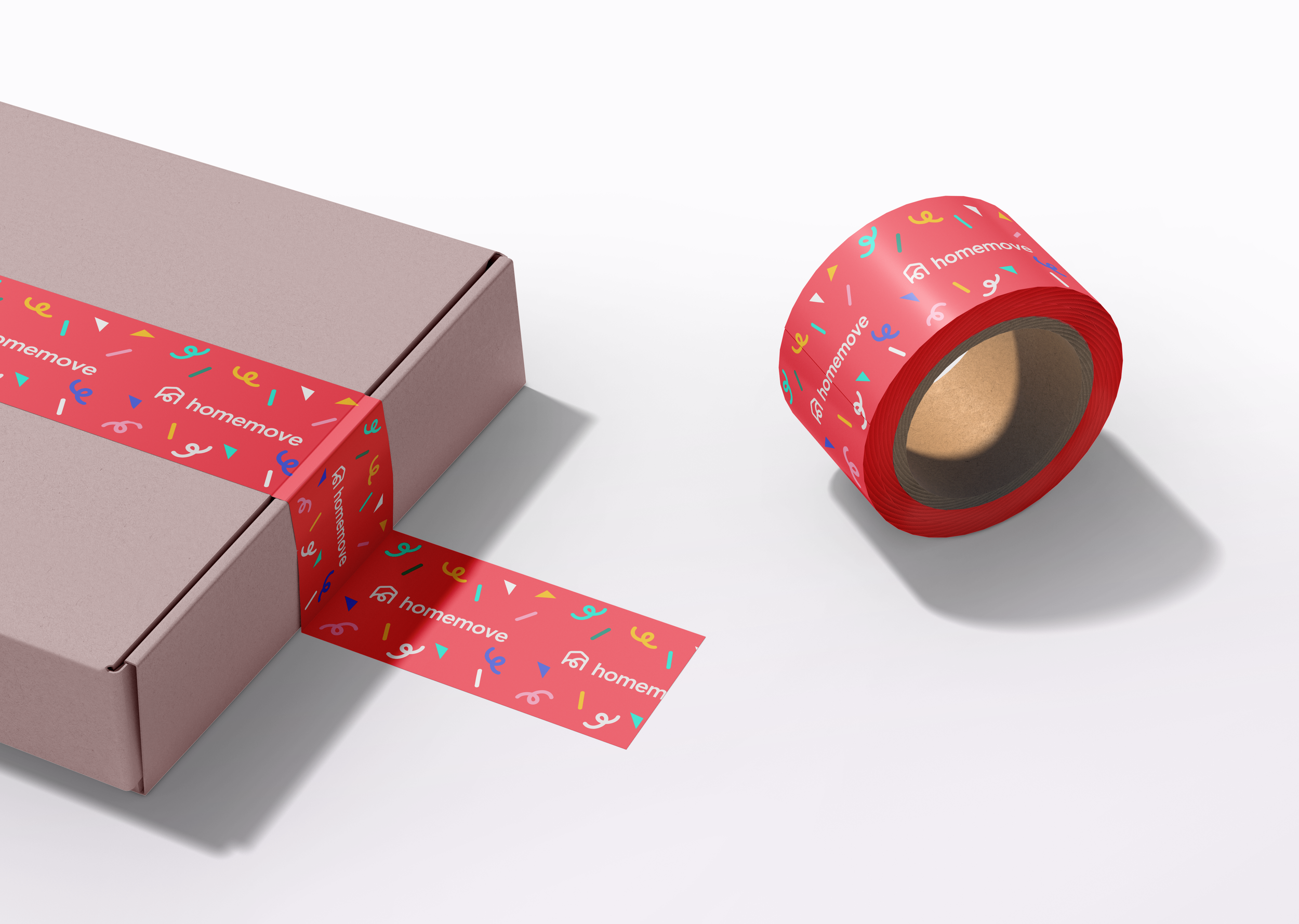
After exploring and experimenting, I crafted a logo that speaks for itself: Home + Move. It’s simple, clean, and clear, yet packed with personality. The ‘M’ becomes the design's hero, representing movement as a versatile design element for marketing and creative campaigns.
The result is a logo that is instantly recognisable, playful, and strong—perfect for a brand that brings energy and ease to the moving experience.

PHOTOGRAPHY
As a startup that embraces the power of AI, Homemove set out to create a photo library using Midjourney. My role was to craft prompts that brought our vision to life—images that feel natural, cosy, and deeply human.
Our photos reflect the warmth and comfort of home, capturing everyday moments that tell a story: kids playing in the living room, tables being lovingly set, or the excitement of unpacking boxes in a new house. It’s about those fleeting yet beautiful snapshots of real life, where you feel safe, connected, and ready to create new memories.
We infuse each image with positivity and forward-looking energy, using natural, warm light and subtle hints of our brand colours.
Movement is key, dynamic focus points add a sense of life and energy, making each photo feel alive and vibrant.
At Homemove, the visuals don’t just show a house, they tell the story of a home.
Branding / UI
My role didn’t stop at creating the branding. With my extensive experience as a web designer, I was brought on to design the website as well.
The challenge was to balance creativity with functionality, crafting a site that felt fresh and engaging while maintaining a clean and accessible UI.
My focus was on ensuring the design was not only visually appealing but also intuitive and easy to navigate, creating a seamless experience for users.


OLD SITE
NEW SITE


Exploring Bold and Playful Ideas
Designing the perfect logo is a journey and every step matters. Along the way, we explored concepts that were bold, playful, or just didn’t quite align with the brand’s core values.
These designs, though ultimately set aside, were an important part of the creative process.
Each one helped refine the vision and guided us toward the final logo.
They deserve a moment of recognition because they represent the thought, effort, and experimentation that went into bringing the brand’s identity to life. Sometimes, the designs that don’t make the cut are just as valuable as the ones that do.


